Responsive Web Design Dallas – Built for Mobile, Built for Growth
💡 Pro Tip: Pairing responsive web design with Dallas local SEO for websites helps you dominate both desktop and mobile search results, giving your business a competitive edge.
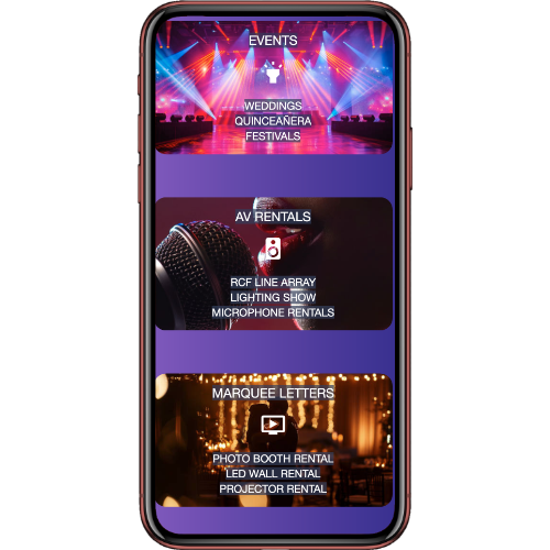


More than 60% of web traffic now comes from mobile devices, and Google ranks mobile-friendly websites higher in search results. If your site isn’t responsive, you’re not just missing out on traffic—you’re losing potential customers. At Creativa Americana, we specialize in responsive web design Dallas that delivers a seamless, visually stunning experience on every device—whether your visitors are browsing from a smartphone, tablet, or desktop. Our mobile-first design approach ensures fast load times, easy navigation, and layouts that adjust perfectly to any screen size.
📱 Don’t Lose Mobile Visitors
starUpgrade to a Responsive Web Design Now
Why Mobile Optimization Matters
- Higher Google Rankings: Google rewards mobile-friendly sites with better search visibility.
- Better User Experience: Visitors stay longer and engage more when your site is easy to use on mobile.
- Increased Conversions: Clear calls-to-action and optimized layouts help turn visitors into customers.
Our Mobile-First Design Process
- User-Centric Layouts – We design with mobile users in mind from the start, ensuring easy navigation and fast loading speeds.
- Fluid Grid Systems – Flexible layouts adapt to different screen sizes without breaking your design.
- Optimized Media – Images and videos are compressed for quick loading without sacrificing quality.
- Touch-Friendly Features – Buttons, menus, and forms are designed for easy interaction on small screens.
Benefits of Our Responsive Web Design Dallas Services
- Improved SEO performance for mobile searches
- Faster load speeds to reduce bounce rates
- Professional, modern look across all devices
- Better engagement and higher lead generation rates
📱 Reach More Dallas Customers on Any Device